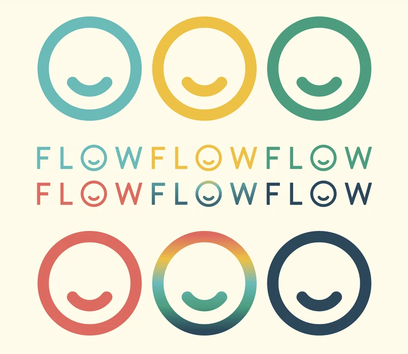
Today, as part of our brand refresh, we’re excited to announce the launch of a new logo for Flow. We know a lot of people loved the old logo and so in this post we want to explain why and how we decided to evolve it.
Flow has grown a lot during our first 5 years and we wanted the new logo to reflect that
The first logo was a great beginning for a startup trying to get on its feet, focusing on getting approval as a medical device and creating an amazing therapy app. Thank you old logo, your swooshy, sail looking, F-shape made us feel like a real company when we were just two Swedes with a dream.
However, in 2022 Flow is no longer just a startup company but a bona fide player in the mental health tech space with a growing community of real and amazing people using our depression treatment every day. These real life experiences and stories inspired us to create a logo that actually reflects what it is we are achieving today and the strong core values we have developed.
How we worked with our customer feedback, product teams to reflect our company values
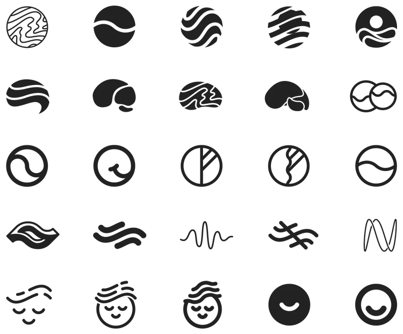
Honestly, no one asked us to change the logo. It was more of a sense internally that we needed something new. So our graphic designer Felix went off and thought deeply about what Flow actually does. The simple answer is we make people feel better. For Felix this is confirmed every day when he reads the incredible stories in the Flow facebook community. With this in mind he drew a bunch of flowing shapes, things that feel soft and good, things with an emotional core. After a few days of endless drawing he arrived at the idea of a smile and a humble simplicity.
A thematic triad
Although Felix could probably talk for many interesting hours about all the finer details of design thinking and meaning of his choices, the visual he settled on is a combination of a smile, someone wearing the headset from top down, and a power on button. This clever conceptual triad combines the themes of feeling better with brain stimulation and using technology to treat depression. Finally, the blue colour gradient represents brain waves like in a scan. The logo like our work in general, balances the warmer ideas of hope and care with more rational concepts of science and tech.
So there you have it. Our new logo and how it was born. The Flow journey will continue to evolve and no doubt the future will bring yet more iterations and innovations. However, we’ll always be Flow, always committed to the same values of care and well being and always, always working to ride the next wave of mental health innovation.
